Brand Identity / iGaming
Super Bets
A dynamic iGaming brand built around speed, high-tech playfulness, gaming energy, and the feeling of winning. The identity gives Super Bets a bold visual presence for a competitive digital betting space.
The Brief
Position a next-gen skill platform
The goal was to make Super Bets feel fast, modern, playful, and competitive while keeping the identity sharp enough for digital-first gaming experiences.
What We Did
Execution
- Created a comprehensive brand identity spanning logo, color palette, typography, iconography, and visual language.
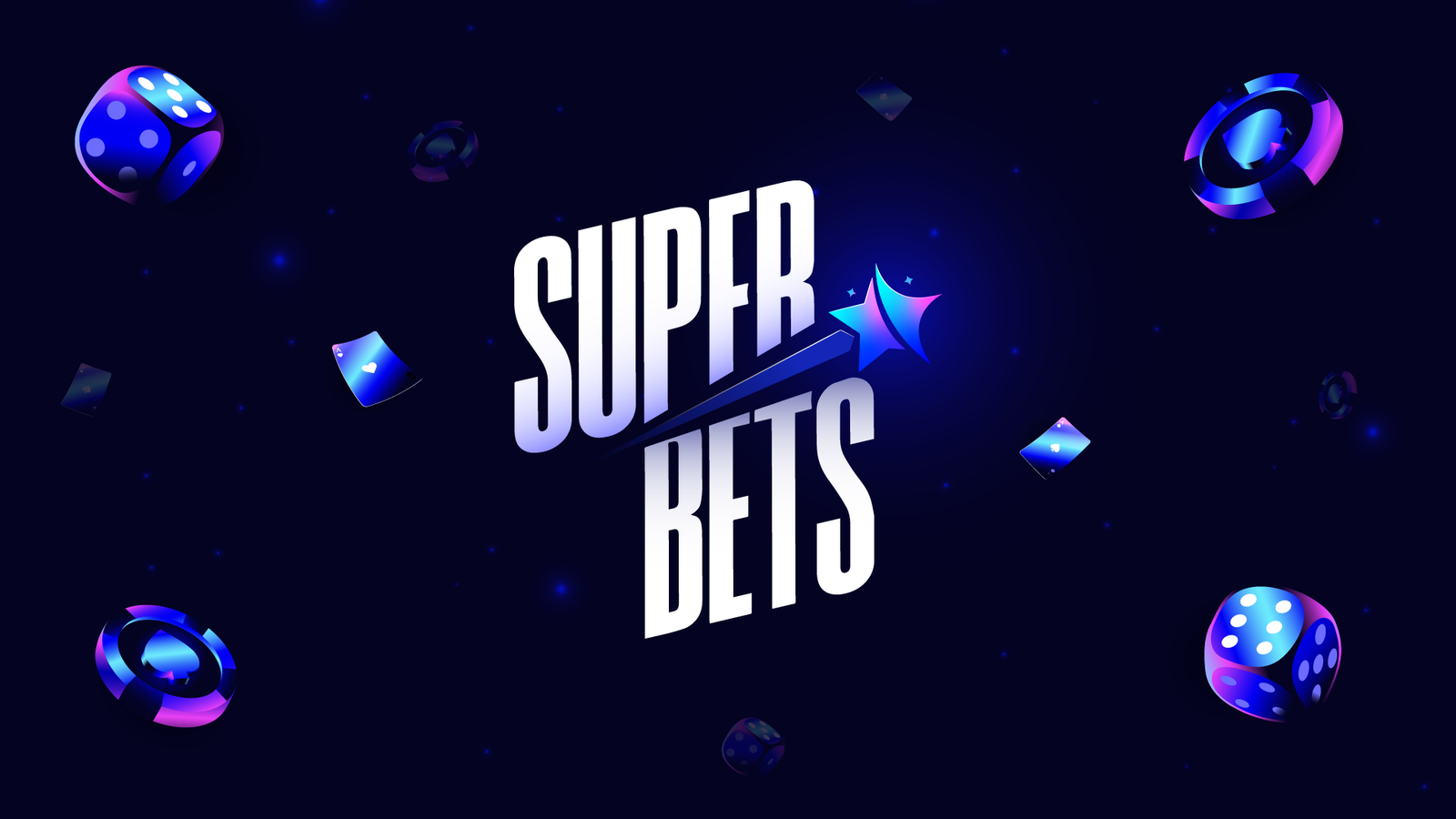
- Built the logo around winning through technique and luck, using a shooting-star idea to signal speed and a wish-come-true moment.
- Developed a cool, playful color palette with a technological edge so the brand feels approachable and advanced.
- Shaped a bold, energetic type direction with narrow letterforms, sharp edges, and diagonal motion.
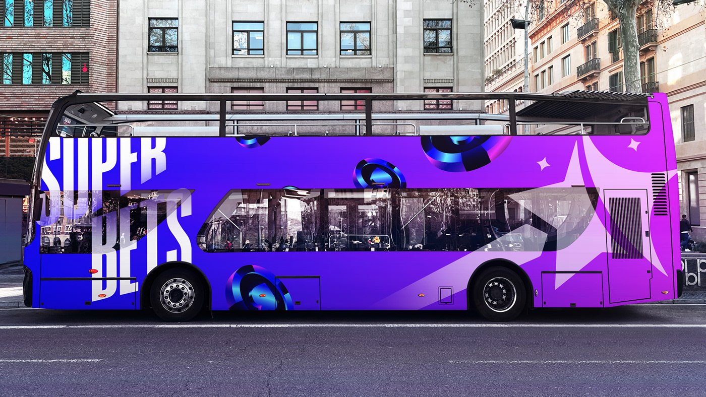
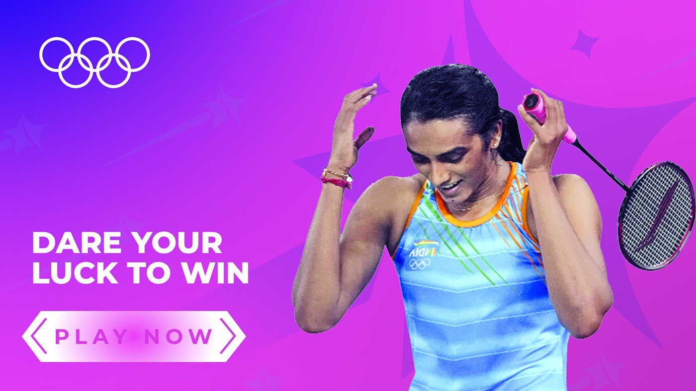
- Extended the identity into website UI/UX, performance creatives, visiting cards, and outdoor renders.
Outcome
What Changed
Super Bets now has a visual system that immediately communicates play, speed, risk, and reward.
The identity works across digital screens, performance creatives, print collateral, and outdoor brand moments.
The brand feels like a next-generation skill platform rather than a generic betting product.
The shooting-star mark creates a fast, lucky, celebratory cue that can scale across campaigns.
Project Showcase
Visual System