Brand Identity / Film Production
Tigerden Films
A complete visual identity for a film production company founded by the Bhullar sisters to create high-quality content with meaning, enrichment, and entertainment.
2023 FoundedA new production company with a clear creative mission.
Complete SystemLogo, color, typography, cards, crew IDs, and posters.
Gotham FamilyBook, Medium, and Bold across communication needs.
The Brief
Build a distinctive film identity
Tigerden needed a versatile identity that could feel cinematic, professional, and immediately recognizable across company and production materials.
Logo DesignBrand IdentityTypographyBusiness CardsCrew IDsPosters
What We Did
Execution
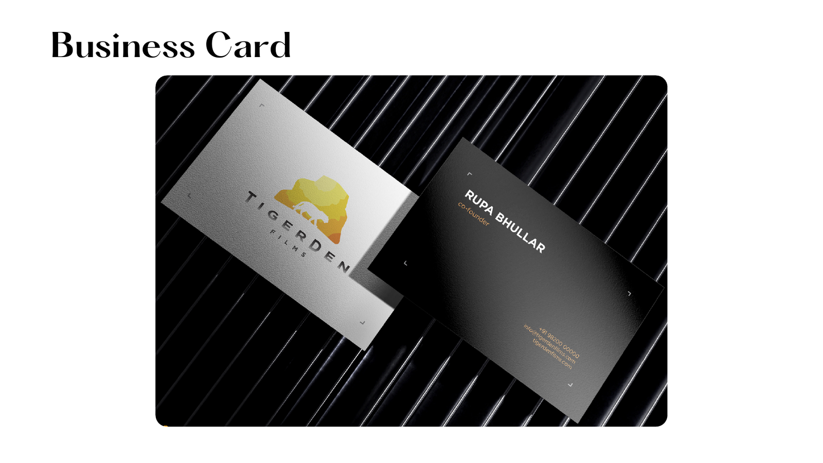
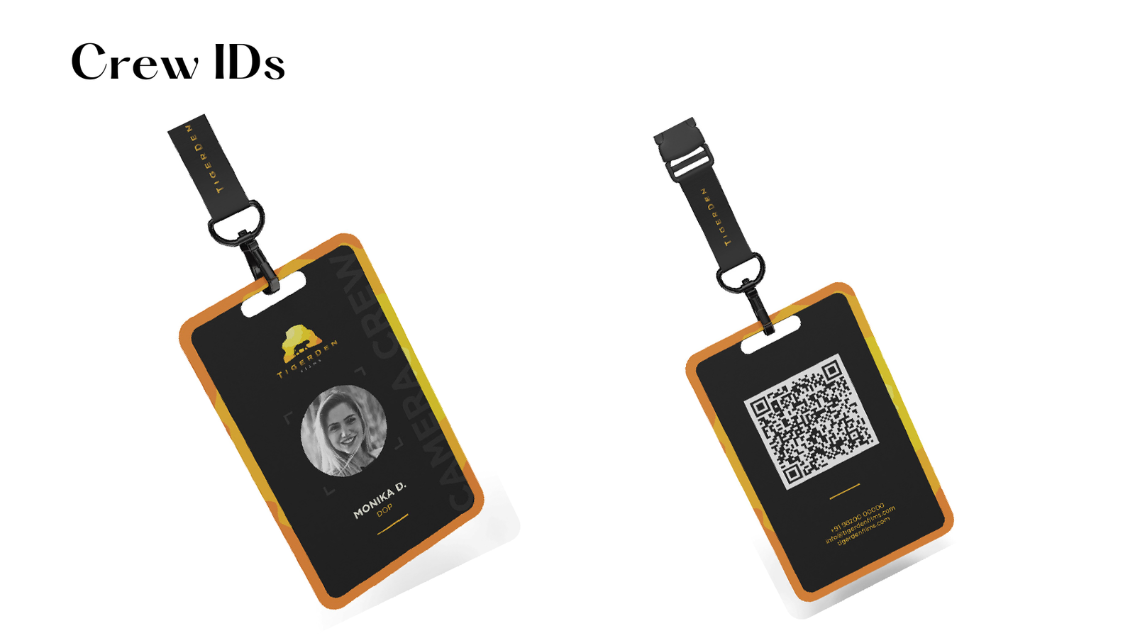
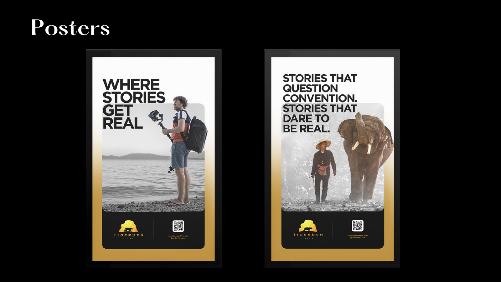
- Created the core visual identity, including the logo, logo variations, color palette, typography, and key collateral.
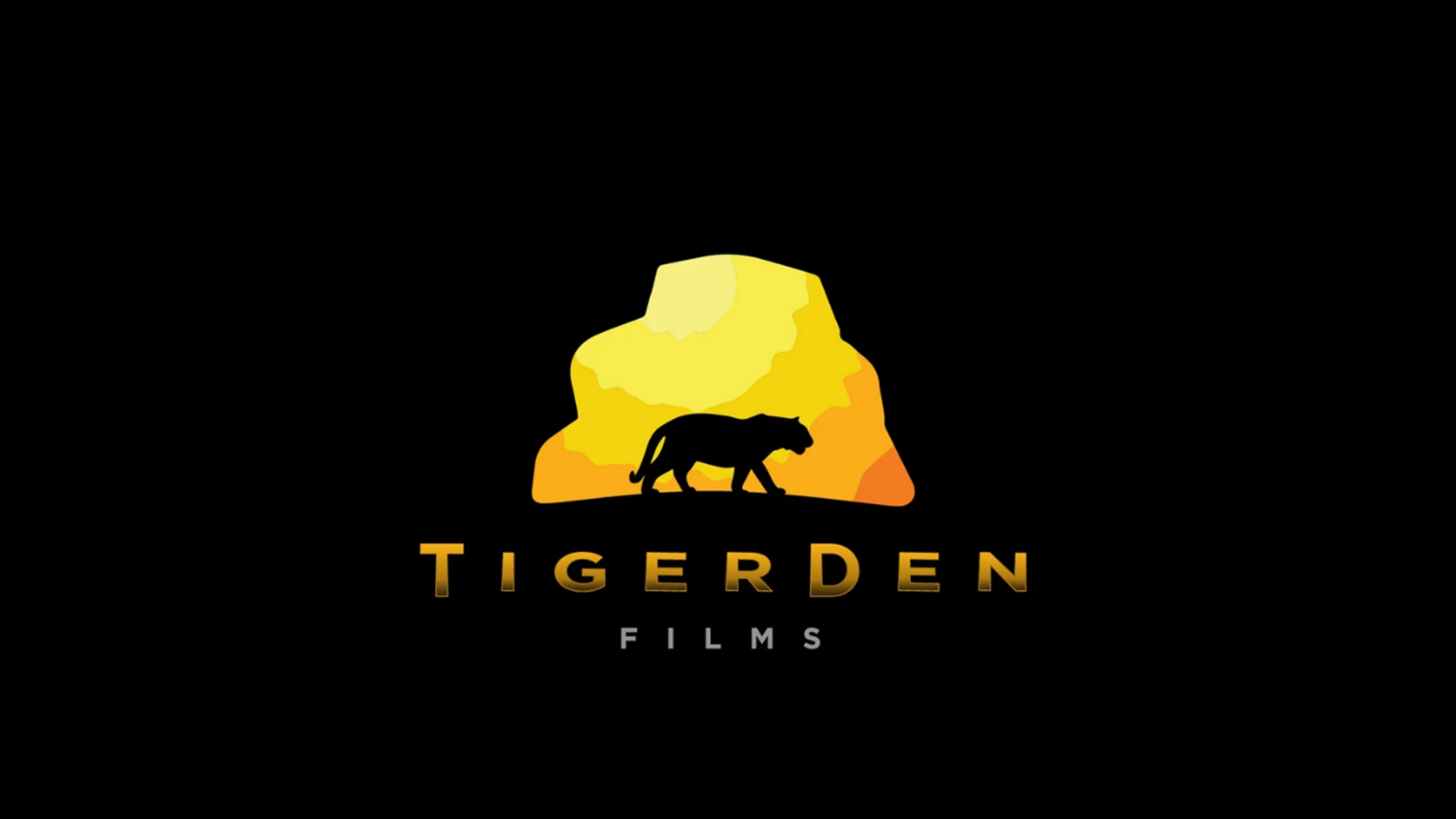
- Combined a tiger silhouette with layered yellow and orange forms to create a bold, memorable symbol.
- Defined Tigerden Orange, Tigerden Black, and supporting warm accent colors.
- Applied the identity to business cards, crew IDs, and poster layouts for professional production use.
Outcome
What Changed
Recognizable core mark
The tiger and layered rock form create a strong production-company symbol.
Practical brand toolkit
The system works across everyday business collateral and on-set production materials.
Cinematic presence
Black, orange, and yellow accents give the identity a dramatic, premium look.
Consistent rollout
Cards, IDs, and posters share a unified language without becoming repetitive.
Project Showcase
Visual System